FormBuilder
The FormBuilder module is a powerful, easy-to-use way to create custom forms to present to your visitors. You can create simple text inputs, checkboxes and selection menus with custom values, long text areas, file uploads, and more!
Building a form is as simple as dragging and dropping the various components into place, and configuring them with a name, label, custom values, etc. The FormBuilder module supports default values, placeholder text, introductory copy, popup help text, and other detailed features that give you control over your forms.
The FormBuilder module provides you with all of the different inputs that you might need to create incredibly detailed forms.
While FormBuilder forms can be accessed as their own independent pages, they can also be easily embedded into any Template Page using the Standalone Form template. This gives you the ability to embed powerful forms directly into pages on your site, providing a fully-integrated experience.
Forms are processed upon submission, and can either display a simple confirmation message that you configure (on a form-by-form basis), or can automatically redirect the user to a page of your choosing.
Forms responses, after being submitted by visitors, are stored in a database, and can optionally be formatted and emailed to an email address. The database stores the raw response in key-value pairs, so that even if the form is edited later to add, remove, or rename fields, each response still maintains its original information, and no responses are lost.
Every form response from every form is available for viewing in the Editor Console, but because two different forms will have two radically different sets of fields in them, you must select the form whose responses you wish to see before being able to peruse the listing of responses. Because of the complexity of creating an interface that allows you to sort the responses in various ways, Manifesto offers the ability to export and download a version of the form responses in a way that allows you to open them as a spreadsheet (e.g. in Excel), where the data can be manipulated any way you want.
Creating a Form
To create a new form, navigate to the Form Builder section of the editorial portal. There are two tabbed sections on this page: Forms and Submissions. If you are not already on the Forms tab, click on it to get there.
At the basic level, a Manifesto form has
A title
Optional introductory copy
A storage method (database or database + email)
Email address if “database + email” is selected
Either “confirmation text” or a “Redirect URL”
Submission cut-off date
Submission capacity
Cut-off message
The Confirmation Text/Redirect option governs whether or not, after submitting the form, the user is shown your custom message on the subsequent page, or the user’s browser is redirected to the page of your choice.
The Submission Cut-off Date may be used as a cut-off date/time after which the form will no longer be presented to users for completion. Instead, they will see a generic message or the text entered into the Cut-off message field.
Similarly, the Submission Capacity field will limit the total number of visitors who may complete the form. Once that number has been reached, visitors will see a generic message or the text entered into the Cut-off message field.
Once you have configured the basic properties of a FormBuilder Form, you must now configure it to add fields.
Note
You may also always click the “Configure” button from the listing page to edit the form fields.
Configuring Your Form
The form configuration interface is designed to be very easy to use, but with enough power to give you the flexibility you need. You start with an empty canvas, and drag-drop-configure each element in your form.
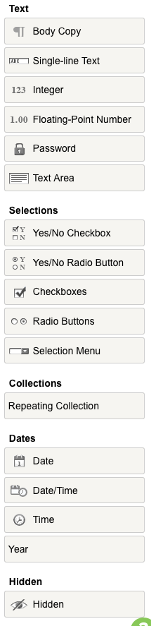
To get started, we will cover the different form components at your disposal, and describe their basic use. Options for customizing all of the fields will be covered below. All forms will automatically get a “Submit” button, so there is no ability to add a button.
First, the one component you can add to your form that is not an input mechanism is Body Copy. You can use this field to add HTML text to your form, from a sentence to many paragraphs. (Individual fields can have introductory copy as well, but larger blocks of text, perhaps covering more than a single field, might merit using this field type.)
Then there are a variety of text-based input fields:
Text input: The single-line text input, for e.g. “First Name”
Integer: A whole number (good for quantities or anything that should not have a decimal place)
Float-Point Number: Designed to hold a float-point number, like a price, or a precise weight
Password: This works like the Text Input, but input will be obfuscated in the box. Please note that, while the input behaves like a password field, the input is still stored in the database in plain text, and should not be considered a secure password.
Text Area: This provides the user with a large, WYSIWYG editor interface for entering large blocks of text, or any copy that requires line breaks.
Next there are selection-based input elements. All of these present the user with a predefined, limited selection of possible responses, and the user must select from among them.
Aside from the boolean (Yes/No) selections, all of these elements share a common set of methods for defining the lists they will present to the user. This is discussed later in this document. The available selection elements are:
Boolean (or Yes/No) Checkbox:: This is presented to the user as a single checkbox with a label. If the user checks the box, its value is submitted. If the box is not checked, no indication of the field is submitted at all.
Boolean (or Yes/No) Radio Buttons:: This is often used to present either/or scenarios where you want a clear A or B indication, like “Company” or “Individual.”
Checkboxes:: Checkboxes provide the user with the ability to select more than one answer to a particular question, e.g. “What are your favorite words?”, displaying all of the options as individual checkbox inputs. You cannot restrict the user from selecting more than one answer with this input.
Radio Buttons:: These work exactly like checkboxes, displaying each available option as a separate input, but is structured in such a way that the user cannot select more than one option (if they select a second option, the first is automatically de-selected).
Selection Menu:: Sometimes known as a Drop-down menu. This element offers a (largely browser-specific designed) menu of available options. Most of the time, the menu displays only a single line item (when inactive) and only allows a single selection, but it can also be made to behave like a multi-select list as well.
The Repeating Collection element can be a huge time saver, as it allows you to define a combination of fields once, and the user can create as many instances of this combination as needed via a simple button to “Add Another.” For example, a job application form might ask the applicant for:
* Example project
* Budget
* Client
but you want the user to be able to add as many project/budget/client responses as they feel appropriate. This is how a repeating collection solves the need to have a predefined number of Project 1/Project 2/Project 3 fields that may be too many or may be too few. The fields within a repeating collection are slightly more restrictive than standalone form elements, but the basic options of text input, dates, and selection menus is available.
The fields
Date
Date/Time
Time, and
Year
are straightforward, providing selection menus for selecting dates and times.
The Hidden element allows you to embed a value into your form which becomes part of the submission, but is never visible by the user.
So these are the pieces you combine to build your form. Aside from their field types, each one has a core of associated configuration data.
First, you can create multiple sections in your form, simply by adding a section name to your field configuration. Each section is rendered within its own
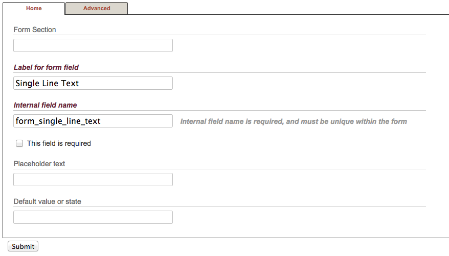
fieldsetelement, using the section name as alegendelement. By default, all fields are added to a “Default” section.The Label for the field should provide the user with a clear definition of the input you are requesting. For simple text inputs, the label defines the input, e.g. “First Name.” For a collection of checkboxes, however, the label will cover the collection, e.g. “Hobbies,” while the individual checkboxes will have their own labels to describe themselves.
The Internal field name is the name actually passed by the form when it is submitted. The internal field name must be unique within your form, so having two fields with the same internal field name will produce unexpected results. The internal field name should be a short, URL-friendly formatted description of your content, e.g. “form_hobbies” rather than “form_what_are_your_favorite_hobbies?”. The
form_prefix is used by Manifesto to help distinguish FormBuilder fields from other commonly-used variables in Manifesto like “id” or “function.”The checkbox This field is required results in the field being tagged with the HTML5 “required” attribute, which means that the form cannot be submitted until a non-empty value is entered. For checkboxes and radio buttons, checking this box will enforce a requirement that at least one of the options must be selected in order to submit.
The Placeholder text uses the HTML “placeholder” attribute to pre-populate the field input with a pre-defined value. This is especially useful when you want to provide your users with an example, or a hint as to the expected format of the response. Placeholder text is generally rendered with faint gray text, and entering text directly into the box immediately overwrites any placeholder. Placeholder text is never submitted, even if the input is left empty.
If you want the field to be pre-populated with a value that will be submitted, but can be changed by the user, you may enter it in the Default value or state field.
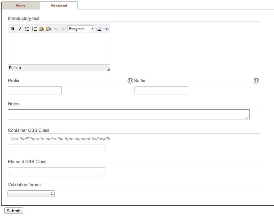
On the “Advanced” tab of the configuration options, there are some additional parameters for your form element.
An Introductory Text will appear above your field. You may write as much as you need, and the text will appear below the field label, but above the input element. Useful for providing more detailed instructions on what you are asking of your users.
The Prefix and Suffix fields can be used to provide small bits of text before and/or after your input. The most common uses of this are for fields expected to contain prices (might use a “$” prefix), and for fields that you want to make clear are optional (might use an “(optional)” suffix.
There are a series of checkboxes to flag the field in particular ways as well
This field is disabled will automatically add a “disabled” property to the field input, making it read-only to the user
Show this field as a column in listings makes this column one of the default columns displayed on the submission listing page
This field is expected to be the contact email for the user marks a field as the one which contains a valid contact address for the user who fills it out. (In other words, any correspondance with the submittor would use the address in this field.)
Use this field as a tally counter The value entered into this field may be used to calculate a tally, e.g. of event attendees (“How many people will be in your party?”)
The Notes field is for tooltip-like notes on the content or format of the field. It is typically presented to the user as a small circle-I which, when clicked on, reveals the note.
The Container Class and Element Class fields allow you to configure your element with custom classes that may be used to style the manner in which they are rendered. The container class is assigned to the tag of the element used as a container for the field label, input, options, etc. The element class is applied only to the specific element, e.g. the text input field itself, or the individual checkboxes.
The Validation Format menu allows you to add a particular validation check to the input. Selecting “email,” for example, will ensure that only a valid email address will be stored in the database.
Note
The outcome of a validation format is also dependent upon whether or not the field is marked as required. If a field with a URL validation format is not required, then if the user enters an invalid URL, the form will submit but an empty value will be stored in the database. If the field is marked as required, however, the form will not submit until a valid URL is entered.
Viewing Submissions
In the FormBuilder section of the Editorial Console, there is a “Submissions” tab that allows you to select from the existing forms to view the submissions made to that form.
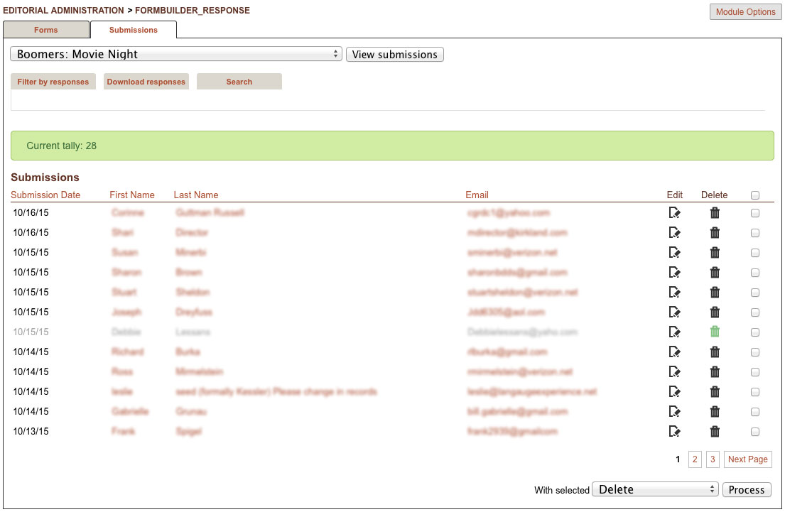
By default, submissions are listed in reverse-chronological order, and the listing will include submissions currently marked as deleted, which appear in grey. This can often occur if, for example, a payment associated with the form has not yet been processed, or another action causes the submissions to be marked as deleted or incomplete.
You may use the icons in each row to edit and resubmit any entry, or to delete unwanted or duplicate entries. There are also checkboxes for each entry that allow you to perform batch operations. Simply tick the box for each of the submissions you want to process, and you are presented below with the ability to execute the following actions:
Delete (batch deletes all selected entries)
Resend (Send email to the designated reciptient for this form)
Resend and Undeleted (Send email, and unmark the entries as deleted, restoring them to active or completed status)
Export (create a CSV file of only the selected entries)
Email Submittors (if the form contains a field designated as a useable contact email address, send a batch email to the submittor. This can be useful in the event of e.g. wanting to contact the authors of all submissions to notify them of cancellations, change of venue, send a thank you, etc).
This last option will present you with an interface for adding a Subject and Body of the email you wish to send.
The fields that appear in the listing are determined during the creation of the form fields. Any number of fields appearing on the form may be marked as “Listing” fields, which means they will appear as columns in the listing. If no fields of the form are explicitly noted as “Listing” fields, Manifesto will use the first 3 defined fields in the form instead. (This sometimes produces undesirable results, such as when one of the first three fields contains an array, or other non-scalar value.)
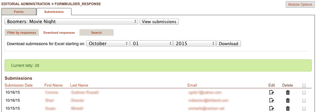
By clicking on the “Download” tab, you can easily download form submissions in CSV format (suitable for opening in Excel), even restricting your download to include only submissions on or after a certain date. The downloaded file includes a column indicating whether or not the submission is active, or deleted as well, so you can use that information to sort or filter in your spreadsheet software.
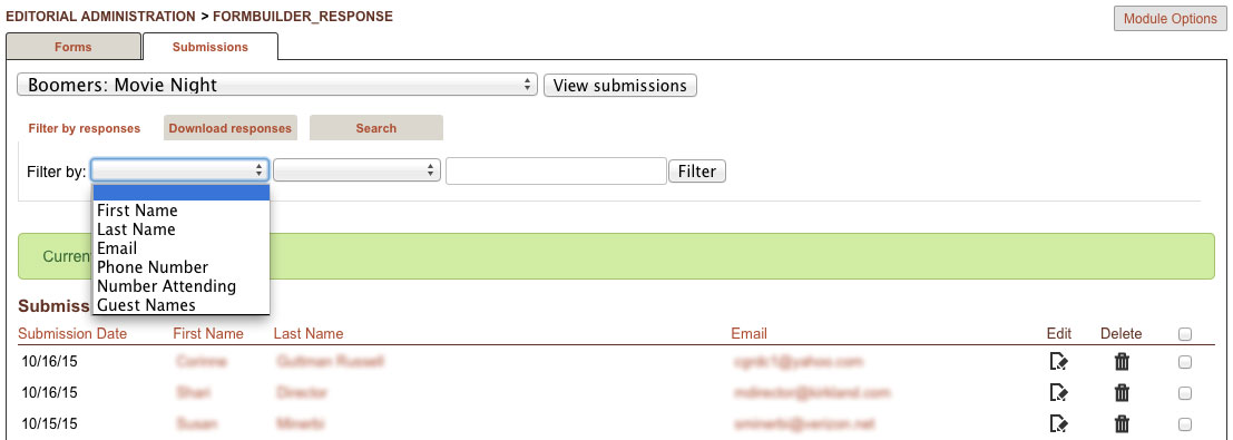
You may also filter the listing by any one of the fields in the form. The filtering is a bit rudimentary, but may be used to locate e.g. any submissions that include a “gmail.com” address, or submissions requesting more that 3 attendees, etc. Just select the field you want to filter on, and then you select an operator &mdash “=” for exact matches; “>” and “<” for fields with numbers, and a generic “matches” option that will match partial strings.
Clicking on any of the linked fields in the listing will pull up the editorial display page for that particular entry.
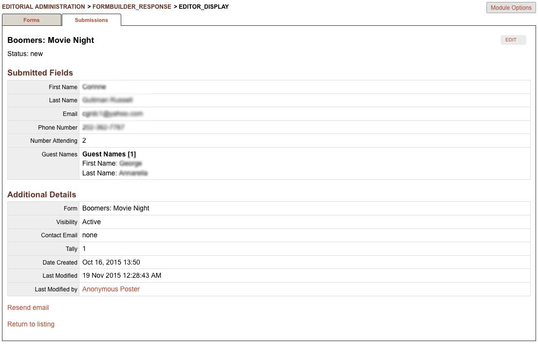
Here you may view all of the fields associated with a form submission, and you may also resend an email copy of the submission to the recipient designated for that form.